Windows Phone 7 is Gearing Up to Take on iOS and Android, Here’s How
The Microsoft Lounge has a relatively large presence at the Internet Week NY HQ, and today it was put to good use with a presentation about Windows Phone 7. Â The presentation was given by Archetype, an app developer that built the Associated Press app for the upcoming phone OS. A smart move considering that Microsoft is going to have to cozy up to the developer community to get all of the apps they’re counting on to make the KIN’s data plans worthwhile and to make Windows Phone 7 a real contender against Apple’s iOS and Google’s Android, which of course have an app store and marketplace respectively.

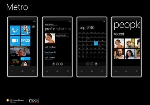
The "Metro" Windows Phone 7 user interface design
While the discussion did get into some specifics about building the app, and how simple it can be for some people, there was a lot of talk about the OS design and features. Â There was even a Windows Phone 7 phone present, but we’ll come back to that. Â The developers talked a lot about the overall “Metro” design that is implemented in WP7. Â Those familiar with the Zune HD have already seen a portion of Metro. Â It features white text on a black background for lists, as well as a theme of panoramas for apps. Â Rather than just scrolling down, or being on page, app designers are encouraged to use several screens, with each of them “bleeding” into the next. Â The effect gives the OS a sleek and modern look that should be helpful in taking on the Apple iOS, which has used design as a selling point since launch.
The big text , as well as the “panel” design of the home screen is supposed to make users more comfortable scrolling down farther than they might on other phones, which seems to work well. Â The white text on black background was decided upon in order to save battery life, but it also makes the design more interesting.
Now – that phone that was out; we weren’t allowed to actually get a hands on impression of the LG test unit with a slide-out landscape QWERTY keyboard, but the OS looked slick on the device, and moved smoothly enough when it wasn’t getting caught up by bugs.  Phones aren’t expected to be out until “holiday season 2010,” so there is still time (we’ve heard Microsoft is looking at an October release, but officially there is nothing firmer than holiday) to kill bugs and offer a solid competitor to Google or Apple.  The most interesting parts of the OS aside from the design and feel was the social integration.  Microsoft is syncing the phone with Xbox Live for achievements and friends lists, on top of other social networks.  The “People” tile on the homepage links contacts’ phone numbers, email, and social networks like Facebook and Windows Live.  Selecting contacts will allow you to see their latest updates, or jump to the social networks directly.
With minimum specs on WP7 phones that will place each around the same as a Nexus One (1 GHz processor, 800×480 screen, 5MP camera) and more (8Gb flash storage minimum, Direct X9 support), and the OS itself, Microsoft seems to have something interesting. The actual phones and carriers will also play a role of course, but by 2011 we’re sure there will be $50,000 diamond encrusted smartphones running WP7 to join their iPhone and Android based luxury brethren. So, if you can stand the wait and want to see how Windows Phone 7 will compare to the iPhone 4 and Android devices like the Droid Incredible and EVO 4G, the mobile space looks like it could get really interesting this year.
